Back to portfolio YourNature — plant care app case study · Dumitru Ciugunov
YourNature · case study
Product designerSolo concept · 4 months · 2026

Their plants were fine. It was the apps they gave up on.

The people I spoke to loved their plants. What they didn't love was an app that only ever nagged, never said how much water to give, and turned one missed day into a red “overdue”. It gave them nothing to come back for, so they stopped opening it. I wanted it to feel more like a friend who knows plants: someone who tells you what to do today, and is happy to see you when you come back.

See how the result was reached ↓ Read from the start
The result · new task card vs the old one
10/10vs 0/10
could say how much water to give
10/10vs 3/10
picked the right action with no help
10 plant owners, each saw both cards · B showed no amount, so 0/10 was a given: that was the flaw · directional, not statistical · concept, not shipped
TL;DR · the 60-second version
Problem

Reminders weren’t the real issue. People wanted to know how much water to give, and they didn’t want to feel like they’d failed after one missed day.

My role

I worked on this alone for 4 months in 2026, from the first interview to testing the prototype.

What I did

I spent time in four plant communities on Facebook and Reddit, read over 200 bad app reviews and talked to 10 plant owners. It all pointed to one screen: the daily task card. I tried 7 versions of it to find one that says how much to water and stays kind when you miss a day. Then I built a prototype and tested it with the same people.

Result

With the new card, all 10 people knew what to do without any help. Only 3 managed that with the old one. They also worked it out twice as fast: about 3 seconds instead of 6. It’s still a concept and hasn’t shipped.

Before the reasoning, the screens
See all 12 screens →
Guest onboarding · live
A first-time user gets a care plan in two taps, with no account. The sign-up ask only comes once the app has been useful.
Ask a friend · live
A user shares their plant with a friend who grows the same one and asks how it's going for them. The photo and species are already attached.
Task actions · live
Three task cards at different points in the streak, then mark done, delay and remove, each confirming in words what changed.
Creating a task · live
How a user sets up a new care task for a plant, step by step, from choosing the plant to the schedule.
Setting a shared goal · live
How a user starts a shared planting goal and brings other people in to work towards it together.
01 · The problem

Plant apps left people unsure, and one missed day made them quit

10 interviews3 Facebook groups + r/plantcare200+ one- and two-star app reviews60–80 posts about quitting appsChecked against a 2020 survey of 2,000 US millennials: 67% found plant care harder than expected
How people ended up leaving
Like dominoes. The app gave nothing back, so one missed day was enough to knock everything over.
01 Logs care for two weeks Waters, notes, ticks every box.
02 Gets nothing back No sign it helped, no idea if it was right.
03 Misses one day Life happens.
04 Sees “1d overdue” in red Two weeks of effort, and this is what shows.
05 Deletes the app It wasn’t worth it. The plant is still alive.

I honestly don't know how often I should water my plants. Sometimes I forget, and other times I worry I'm doing too much. I just want something simple that tells me what to do.

Beginner plant owner, interview · Facebook plant group
How I did the research

Go wide, narrow down, then do it again

I followed the Double Diamond. The first diamond was about finding the right problem. The second was about finding the right fix. I talked to people in both.

DiscoverDefine
DevelopDeliver
Discovergo wide

I read plant groups, app reviews and posts, then talked to ten plant owners about why they gave up on their apps.

Research round 1
Definenarrow down

“Remind people” became “tell them how much, and make sure a missed day never feels like failing.”

Developgo wide again

Seven task cards, four ideas for fixing the shared goal, and a Home screen without the stories row.

Delivernarrow again

Both cards tested with the same ten people, then the prototype. Every fix went back in front of someone.

Research round 2
Step by step
1Decide what to ask

Before each round, I wrote down what I wanted to find out. First: why do people quit plant apps? Later: can people find answers from each page?

2Find the people

I’m not on Facebook much, but I knew plant groups there were busy. They were a goldmine: people asking for help, sharing wins, and admitting what they’d stopped doing.

3Pick the method

The Double Diamond above. It kept me from jumping to screens before I knew what the problem really was.

4Listen and read

3 Facebook groups and r/plantcare. 10 interviews, ages 26 to 56, beginners to experts. 200+ one- and two-star app reviews, each sorted by complaint. 60–80 posts about overall struggles.

5Make sense of it

I held every finding up against the questions from step 1. That’s how the brief changed from reminders to amounts, and to going easy on missed days.

Keeping a small study honest
Not all at once

I spread the ten interviews out instead of doing them back to back, so the first few chats didn’t colour how I heard the rest. In the card test, half the people saw A first and half saw B first.

Long enough to trust

Everyone finished all three task cards, not just one. I wanted it to be consistent. One lucky tap shouldn’t decide a design or become a data

What people say vs what they do

What people told me and what they actually did went into separate notes. Both matter, but they aren’t the same thing.

I did research twice: at the start, and again while testing. There’s nothing from after launch, because the app hasn’t launched.

✓
The outcome

The brief changed from “remind people to water” to three goals, one for each step in the chain above.

01Say how much water to give

People weren’t sure if they were doing it right.

02Show their care is paying off

Two weeks of logging gave them nothing back.

03Make a missed day cost nothing

One missed day was enough to make them quit.
+ The raw research, if you want it

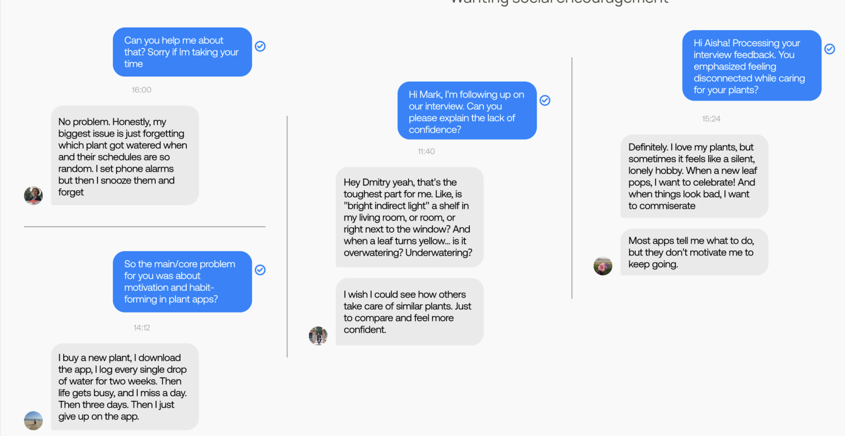
The chats, grouped by what they showed. Random schedules, feeling unsure, wanting company.

Three columns of Facebook chats with plant owners about forgetting schedules, feeling unsure, and wanting encouragement
Composite research patterns
Synthesised from 10 interviews
The uncertain beginner
Composite archetype
Unsure Cautious Wants a clear answer

"I honestly don't know how often I should water my plants. Sometimes I forget, and other times I worry I'm doing too much. I just want something simple that tells me what to do."

Became → the amount on the task card
The busy owner
Composite archetype
Busy Practical Efficient

"My schedule changes all the time, so I can't always follow strict reminders. I need something flexible that lets me adjust tasks without feeling like I failed."

Became → skip vs delay, and the calm late state
The progress watcher
Composite archetype
Reflective Growth-oriented Goal-driven

"I love seeing my plants grow, but I don't really track anything. After a while I lose motivation. If I could see progress over time, I think I'd stay more consistent."

Became → Grown with you, the growth-history screen
The sociable owner
Composite archetype
Sociable Encouraging Comparative

"I enjoy seeing how other people take care of their plants. It makes me want to do better too. Sharing progress would make plant care more fun and motivating."

Became → shared planting goals

The four profiles are made up from all ten interviews, so none of them is a real person, and there are no names because everyone was promised they wouldn't be identifiable. The quotes are real. Each one is word for word what someone said, picked because it sums up that profile best.

Who I spoke to
Plant owners interviewed10
Beginner owners4
Experienced owners6
Age range26 to 56
Had used a plant-care app before9
Took part in the card test
the same ten I interviewed
10
Used the working prototype
the same ten I interviewed
10
Recruitment3 Facebook groups
Sources
  1. OnePoll for Article, the furniture retailer (2020). Survey of 2,000 US millennials aged 25–39 on houseplant ownership. 67% found plant care harder than expected, and 20% cited the pressure.
  2. University of Maryland Extension, Winter Indoor Plant Problems. Overwatering is named the number one reason indoor plants die.
  3. Iowa State University Extension, Diagnosing Houseplant Problems Related to Poor Culture. Root rot causes wilting, which prompts further watering.
  4. Stawarz, K., Cox, A. L. & Blandford, A. (2015). Beyond Self-Tracking and Reminders: Designing Smartphone Apps That Support Habit Formation. CHI '15, 2653–2662.
  5. Schultz, W., Dayan, P. & Montague, P. R. (1997). A Neural Substrate of Prediction and Reward. Science 275(5306). The dopamine response shifts from the reward to the cue that predicts it.
  6. Sailer, M. et al. (2017), Computers in Human Behavior. Deci, Koestner & Ryan (1999) meta-analysis on extrinsic reward. JMIR Serious Games (2021) on leaderboards and lower performers. All used in section 05.
02 · What each screen answers

Four screens, and the question each one answers

None of these started as a feature idea. If a screen couldn't name the question it answered, it didn't make it in.
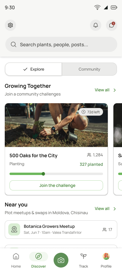
The app in one picture · four main tabs
Each coloured dot is a research gap. Tap it to jump to the fix.
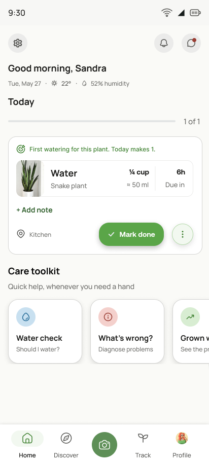
Signed-in home: Good morning Sandra, today’s watering task with ¼ cup and a Mark done button, then the care toolkit
01Home
“What do I do today?”
Today’s taskExact amountMark doneCare toolkit
Discover tab: Explore for browsing plants, and Community
02Discover
“Is anyone else doing this?”
Explore plantsCommunityGoals & meetups
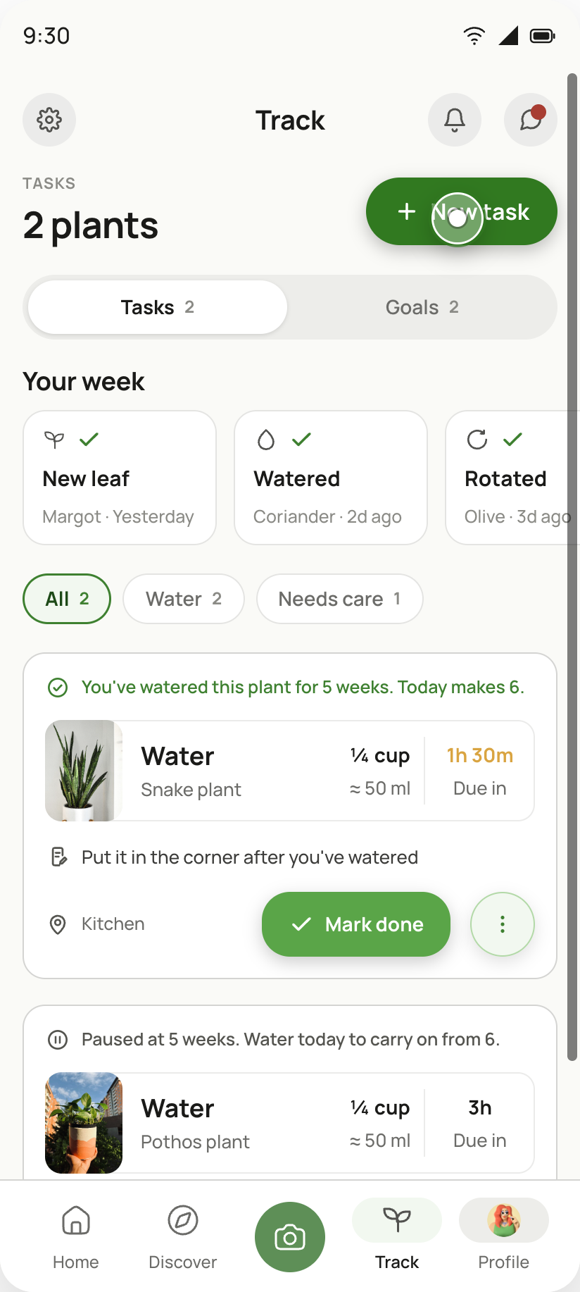
Track tab: tasks and shared goals in one list
03Track
“What’s due, and what have I joined?”
Every taskShared goalsYour week
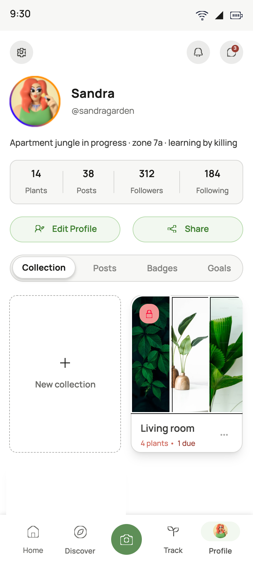
Sandra’s profile: plants, posts and followers counts, then Collection, Posts, Badges and Goals tabs with a Living room collection showing 1 due
04Profile
“Is any of this working?”
Collections by roomPlant countBadgesGoals
✓
The outcome

Four screens cover all four gaps, and each one traces back to a sentence somebody said. Four screens I had already finished aren't here. A row of friends' story bubbles across the top of home, like Instagram, an account request before you could use anything, a standalone badges page and a weekly featured-plant feed all went, because none of them could name their question.

03 · One card, not three

Three task cards became one that says how much to water

Home, Track and Collection each had their own task card. Side by side they felt like three apps, and none said how much water to give. Seven designs later, one card runs everywhere.
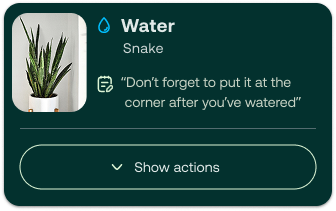
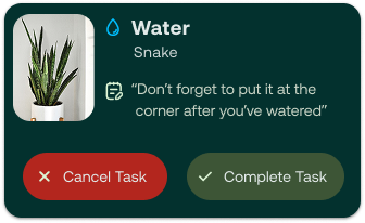
7 designs in three weeks · 4 shown
B and A are the two I tested
Design 2
An early task card with a Show actions control
Every action hidden behind “Show actions”.
Design 4
The early card with Cancel Task in red and Complete Task in green
Two equal buttons, one red. Which one finishes the task?
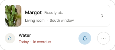
B · design 6
Surface-specific card: plant row, then Water, Today, 1d overdue
Plant named twice, no amount, “1d overdue” the loudest thing.
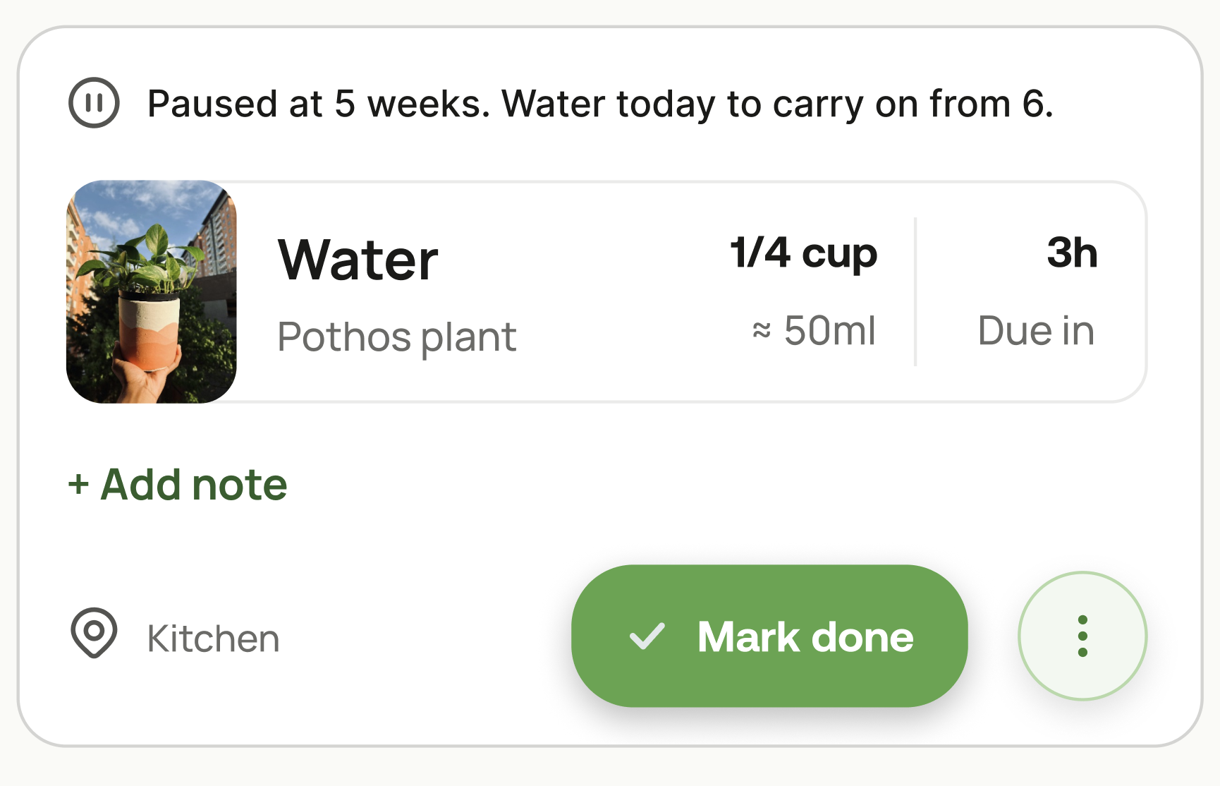
A · design 7
Final task card: Paused at 5 weeks, Water, Pothos plant, 1/4 cup, 3h, Mark done
Which plant, what task, how much, how long. One primary action.
The test · A vs B
I showed 10 plant owners both cards, one at a time, and asked: “What does this card want you to do?” Half saw A first, half saw B first. No hints.
Said how much water to give
A
10/10
B
0/10
Picked the right action with no help
A
10/10
B
3/10
Explained skip vs delay correctly
A
7/10
B
2/10
Would want this card in the app
A
10/10
B
2/10
Time to know what to do
3.0svs 5.9s
From seeing the card to saying the next step out loud. Median, A vs B.
How easy it felt
6.1vs 3.8
Their own rating after each card, from 1 (very hard) to 7 (very easy).
How far I'd trust it

The same ten people I'd interviewed, so they already knew the problem. It tells me A is clearer than B, not that it works for everyone. The 3 of 10 who still mixed up skip and delay sent me to the wording, below.

Where the number comes from

How the app knows it's ¼ cup

Experts say about ¼ of the pot's volume. The app does the maths. A starting point, not a lab reading, but better than “water well”.

Your pot8 cm≈ 250 ml soil
→
The rule× ¼of the pot
→
On the card¼ cup≈ 50–60 ml
The watering task on the home card: Water, Snake plant, ¼ cup, about 50 ml, due in 6h
Less for succulents and in winter. The app adjusts, you just pour.
The hardest small argument

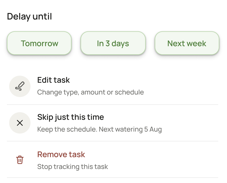
"Delay" keeps the task owed. "Skip" cancels it once.
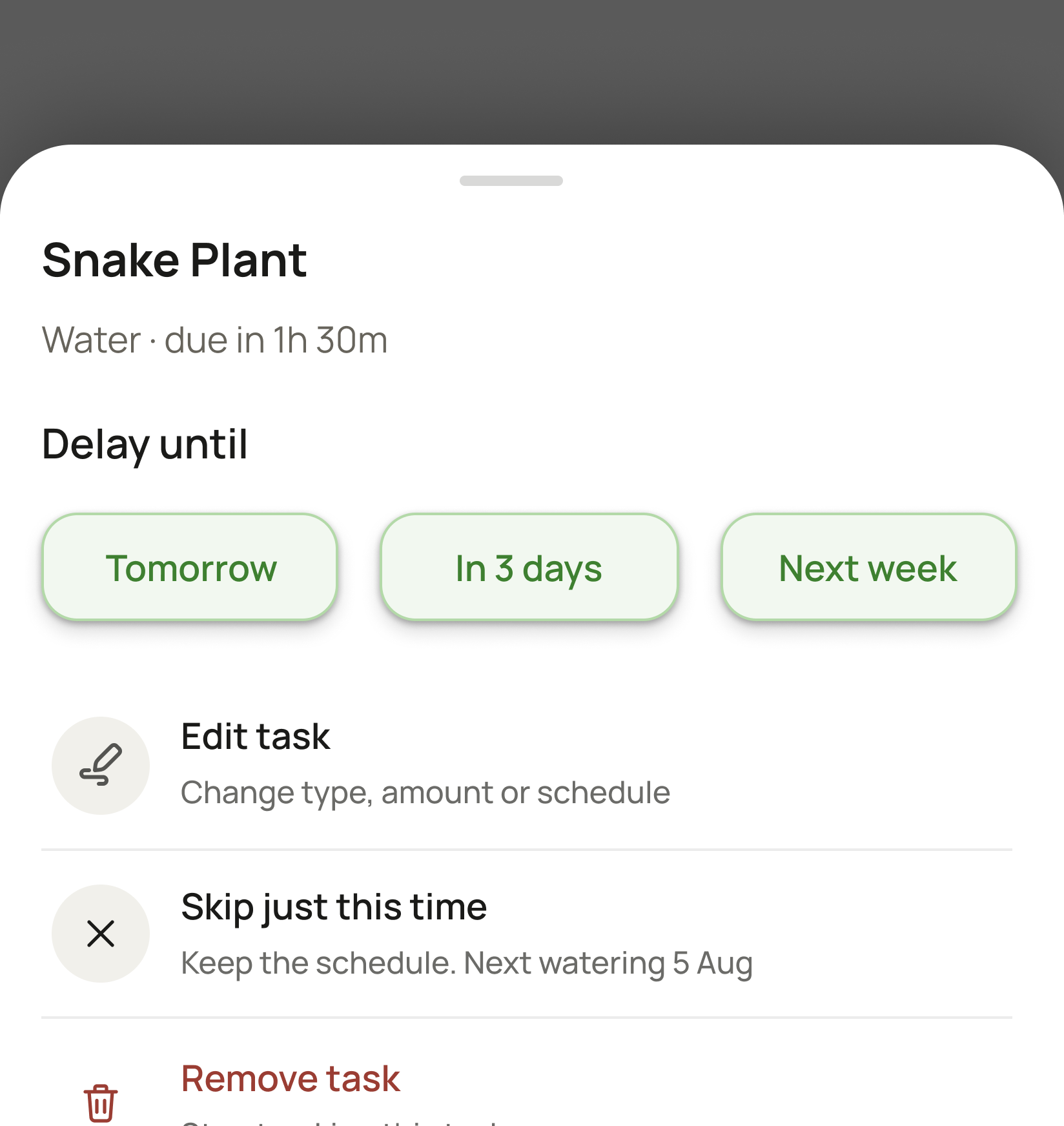
Task options sheet for Snake Plant: Delay until Tomorrow, In 3 days or Next week, then Edit task, Skip just this time with the line Keep the schedule. Next watering 5 Aug, and Remove task
1
2
Both live in the sheet behind the ⋮ on a task card.
1Delay
Still owed, just not today. It comes back on the day you pick.
Mon
✓Tue
Wed
Thu
Fri
Sat
Sun
Mon
Weekly plant, delayed to tomorrow: watered Tuesday.
2Skip just this time
Cancelled once. The plant waits for its usual day.
✕Mon
Tue
Wed
Thu
Fri
Sat
Sun
✓Mon
Weekly plant, skipped: next watering next Monday, as normal.
How I resolved it

I kept both names and added one line under “Skip just this time”: “Keep the schedule. Next watering 5 Aug.” Now you can see the difference before you tap. Delay moves the task, skip keeps your usual day.

✓
The outcome

Version A went into all three surfaces. It carries an amount, so nothing in the app says “water well” again, and that change lives in the component, not in a new feature.

04 · The mistake

A tester broke my goal system without trying to

In a shared goal, a community plants toward one number. During a usability test, a tester typed 400 into a 500-tree goal and nothing stopped her. I only found it by watching someone else.

BeforeMy first design

Anyone could type any number

I assumed a few bad numbers would get lost among hundreds of honest ones. One phone at home can finish or wreck the goal for everyone on it.

The goal counts what people say they planted.
AfterThe fix

Count the saplings, not the claims

A phone can’t prove a tree went in the ground, but saplings arrive in a crate with a delivery slip. Your count comes from the lead’s tally, so 400 isn’t a number the screen accepts.

A session can never count more trees than it had saplings.
How I got there

Four ideas I brainstormed, and why none made it to a screen

Each one had the same flaw: strangers doing unpaid checking while an honest person waited.

Idea 1✕
Location proof
Proves a phone was there, not a tree. Easy to spoof, and it asks for location at the worst moment.
Idea 2✕
Limit, photo and two witnesses
People plant alone, so real claims would wait days for a stranger, and fake ones would go through anyway.
Idea 3✕
Confirm others to earn a higher limit
Two friends could confirm each other back and forth without planting anything.
Idea 4✕
Hide claims from people you follow
It closes that loophole, but still asks strangers to judge photos for free.
What I built✓
Count the crate
Count something that already arrives with a receipt. Nobody has to judge anyone.
Second pass

Then the fix buried newcomers in numbers

All that accounting landed on the goal page, so a first-timer met an audit before a Join button. I split the page by what the person is doing and moved the ledger to its own page, How the count works.

Before
15numbers before you could join
countedpendingallocatedreturnedclosedreconciled
Six words I had invented, all on the first screen.
After
3numbers, in plain words
Sapling ledger→Where every sapling went
Handed back to stock→Came back unplanted
The crate reconciles→It adds up
The outcome · what I took from it

A static screen can't be abused, so this only surfaced because someone used the prototype. Each fix went back into testing for the next person to try to break.

Still open: everything now rests on the session lead's screen: handing saplings out, taking them back, closing the count. That's what I'd build next and test with real leads.

05 · Progress you keep

A missed day costs nothing, and the record only goes up

People asked for “motivation” but couldn't say what would motivate them, so I went to the research. One rule came out of it.

The rule

If a reward can be taken away, it works as a punishment too.

Most apps · you miss a day
5→0Streak lost. 1d overdue.
Five weeks of effort gone in one day. This is the moment people told me they deleted the app.
YourNature · you miss a day
5Paused at 5 weeks. Water today to carry on from 6.
The count freezes, late is written in words, and coming back is one tap.
Kept, rebuilt

Streaks pause, never reset

The count waits for you.

Built last

The card says what today adds

“Today makes 6” sits above the task.

Kept, scoped

No ranking against strangers

Only inside a shared goal, off by default.

Cut outright

No surprise rewards

A surprise has to sometimes not pay out, so it punishes too.

LiveToday · task card

The same card on track, paused, and brand new

It shows all three states, then runs mark done, delay and remove. Each one confirms in words what changed.

The long-term record · plant page

Show what the user did, not what the app guesses
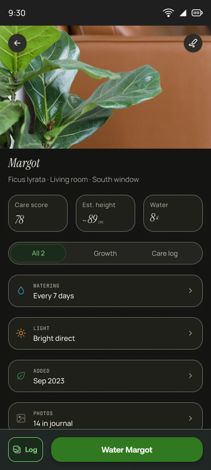
Before
The original plant page. Under the photo, the name Margot sits over three boxes reading Care score 78, Est. height about 89cm, and Water 8d. Below them are three tabs, All 2, Growth and Care log, then four rows: Watering every 7 days, Light bright direct, Added Sep 2023, and Photos 14 in journal.
Care score 78, a guessed height, three tabs.
After · live
  • 1Score out, counts in. “47 waterings, last 8 days ago” is a fact you can check.
  • 2A weekly water chart. A gap is named in plain words, never graded.
  • 3Tabs gone. One page to scroll, so nothing hides behind a tap.
Same rule · what I cut from the plant page
The app guessed a height, then asked the user to check it

It falls when you prune, it's a guess on a page of facts, and checking it means measuring the plant anyway. The photo journal took its place.

If I can't answer “how do you know that”, it doesn't go on the screen.

Estimated Height ~89cm Measure the height and see if we’re right. It’ll help future estimates even better!
Estimated Height ~89cm You’re Awesome!Our app is becoming a better and more valuable place because of you!
✓
The outcome

Nothing can be taken off you. Missing a day costs nothing, and every number on the plant page is something you logged yourself.

06 · Useful first

I cut two things that were not useful

A stories row and a sign-up flow. Both were finished, both looked good, both answered the wrong question first.

Decision 1Home screen

Home gave its best strip to other people

When you open the app, you really want to know one thing: what does my plant need today? My first Home screen made friends’ stories the first thing you saw, which distracted from the real action and the reason for the page.

Friends’ stories→Today’s task

Stories were fun, but they pulled your eyes away from your own plants. They’re also hard to keep kind and easy to misuse, so they didn’t really belong here. The social side didn’t disappear, though. It moved into small moments around the app, like asking a friend who grows the same plant.

“You may like”→Care toolkit

Recommendations are just more stuff to scroll through, and nobody opens Home hoping for more stuff. The toolkit puts the things you actually reach for right there instead.
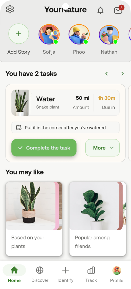
Before
Earlier home screen: a stories row across the top, You have 2 tasks, the old task card, and a You may like row
Stories first, your tasks below the fold.
After
Current home screen when signed in: Good morning Sandra, a Today progress bar, the water task card for a Snake plant with a Mark done button, then the Care toolkit row
Today's task is the first thing you see.
Decision 2Sign-up

The account ask comes last, after the app has been useful

People open a plant app when something has already gone wrong, which is a bad moment to ask for an email. A guest now gets a care plan in two taps first.

BeforeAccount first
9screens before the app does anything for your plant
AfterGuest onboarding · live
3screens to a care plan, no account needed
Business vs user needs

The business needs accounts. The user needs help first.

So the app helps you first and only asks for an account once you want to stay.

1
Add a plant
As a guest, with no sign-up
2
Get its care plan
You get help right away
3
Sign up when ready
The business gets its account
4
Nothing is lost
Plants, tasks and settings come with you
The plans

Everything I promised is free. You only pay once your collection grows.

FreeUp to 5 plantsEvery core feature included
YourNature+More plants, more collection spacePlus family sharing

The upgrade prompt only appears when you add a 6th plant.

My first draft charged for these. I moved them all to free:
Your own care historyHelp with a sick plantDouble points for paying
After · live
Try switching between yearly and monthly, and open the questions.
Prototyped Ask a friend · live

What social looks like once it stops being a feed

Social came back around the plants themselves. From any plant page you see which friends grow the same species, and the photo and species travel with the message, so the chat already has a subject.

✓
The outcome

Home answers “what does my plant need?” before “what are my friends doing?”, and the app proves it's useful before it asks for anything back.

07 · Craft and accessibility

Four small calls that keep the app clear and honest

Colour

One green was doing four jobs

Before · one green, four jobs
Button
Tab
Chart
Icon
After · six colours, one job each
Action
Select
Data
Water
Feed
Danger

“Add fertiliser” sat next to “toxic to your cat”. Now a safety warning can never look like a care tip, which is why late is written in words and feeding is brown.

Pattern

Options open in a sheet, not a menu

The task options sheet: delay by date, edit, skip just this time with the schedule it keeps, and remove
⋮
24dp icon · 48dp target
Read aloud as “More options for Margot”

It lands in the same place every time and has room for a second line, so each option says what it will do before you pick it.

Accessibility

Set up in the first minute

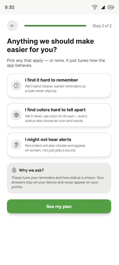
Onboarding step 2 of 2: Anything we should make easier for you, with optional accessibility preferences
Step 2 of 2 · optional
Earlier, wordier remindersStatus never by colour aloneVibrating alerts

Every answer changes how the app behaves, and each one can be tried before it is accepted.

The system

Six sizes, four steps, one typeface

Aa22
Aa20
Aa18
Aa16
Aa14
Aa12
4
8
16
20
Manrope 400–80048dp minimum target

Where it leaks: screens drawn before the library still carry off-scale values. Auditing them back is on the list.
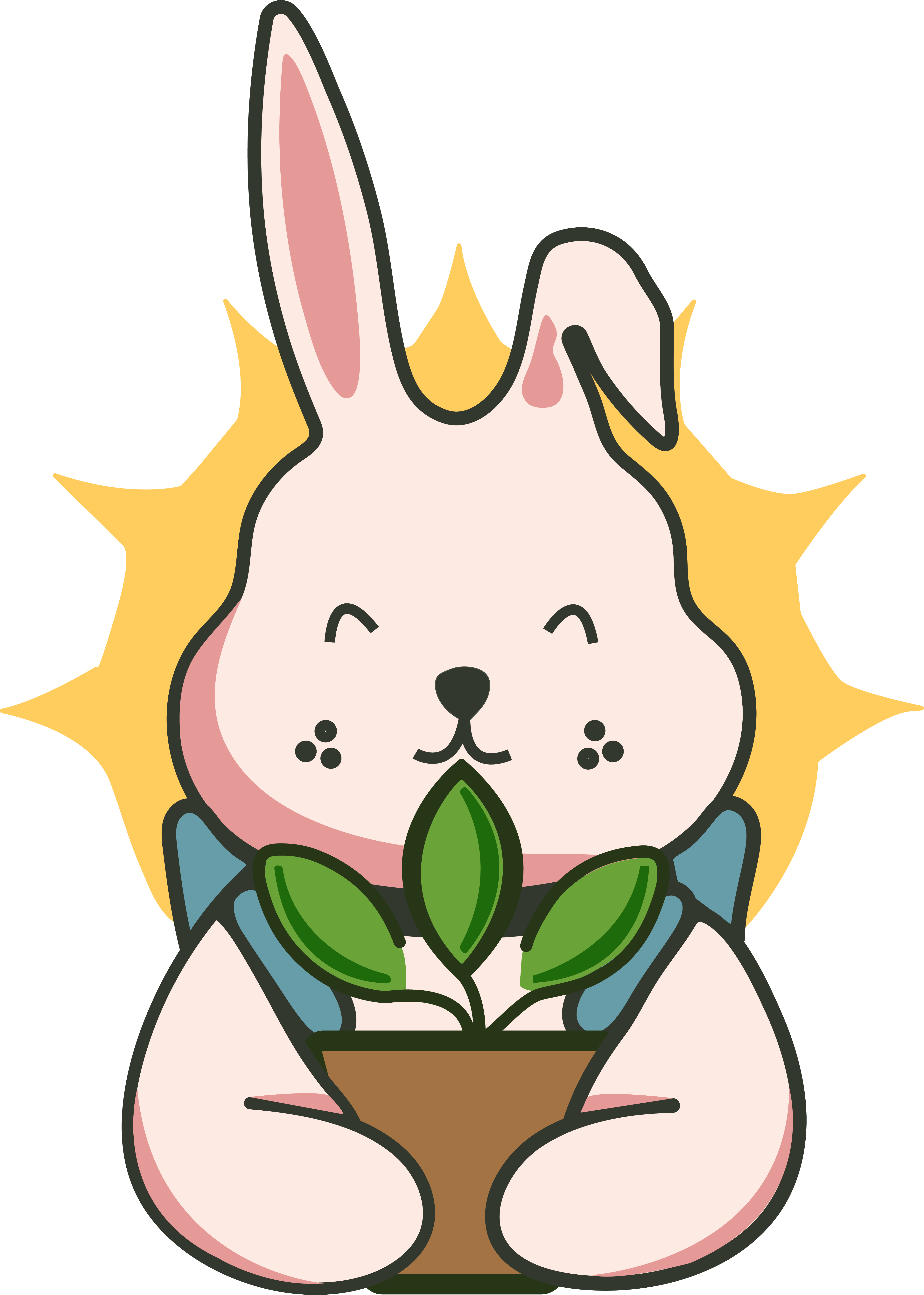
The YourNature mascot: a smiling pink rabbit with one floppy ear, hugging a brown pot with a green sprout, in front of a yellow sunburst
Artboard · YourNature mascot
Shown the way it sits in Illustrator: artboard grid, centre guides and the selected artwork.
Brand

I drew the mascot myself, by hand, in Illustrator

The rabbit hugging a sprout is the app’s logo. No template, no stock art and no AI. I built it shape by shape with the pen tool. It’s meant to feel like the rest of the app: a friend who’s happy to see you, not a reminder that tells you off.

Its colours
Outline#343A2E
Fur#FCE9E1
Shade#E49A98
Leaf#6AA338
Pot#A27548
Sun#FCCB5E
  • One outline for everything. Every shape shares the same dark stroke with round ends, so nothing looks sharp.
  • Flat shading, no gradients. It stays clear when it shrinks down to an app icon.
Hand-off

From Figma to code, without a redline

Developers don’t need hand-typed sizes anymore. The files carry those. What they need is the behaviour.

01Figma

Screens, components and colour tokens. This is the source file.

02Claude Design

I imported the Figma file and rebuilt the screens as working prototypes. These are what people tested.

03Claude Code → developer

Claude Design exports a handoff bundle: components, tokens, layout and assets. A developer reviews the code it writes.

The app hasn’t shipped, so step 03 hasn’t run on a real codebase yet.
What I’d still write down: the task card’s four states
You've watered this plant for 5 weeks. Today makes 6.
Snake plant WaterSnake plant ¼ cup≈ 50 ml 1h 30mleft
Kitchen ✓ Mark done⋮
Shown at its real size, in the “on track” state.
StateLine colourLine above the taskButton
On track#3E8030“You’ve watered this plant for 5 weeks. Today makes 6.”Mark done
Paused#545451“Paused at 5 weeks. Water today to carry on from 6.”Mark done
New#3E8030“First watering for this plant. Today makes 1.”Mark done
Done#265C22“Six weeks in a row. Today counted.”Done

State is never shown by colour alone. Every state has its own words, and paused has its own icon.

08 · How I'd validate it

One two-week test would tell me if this works

Nothing here has shipped, so there's no real usage data yet. This is the first study I'd run: the same people use the app for two weeks and skip one day on purpose.

Day 1Start
Task“Show me how much water this plant needs today.”
✓Finds it on the card in a few seconds
✕Looks elsewhere, or guesses
Baseline, 1 to 7“How sure are you that you’re caring for this plant the right way?”
→Asked again, word for word, on day 14
Day 7They skip a day on purpose
I watch, then askDo they open the app the next day? Then: “What went through your mind when you saw the task?”
✓They come back and describe it as normal
✕They stay away, or say “guilty” or “told off”
Day 14End · the one that matters
I compareThe day 1 baseline, asked again
✓The score is higher than on day 1
✕No change. Then nothing else matters
SeparatelyDo guests create an account after saving their first plant? If they look around but never sign up, the sign-up ask is in the wrong place.
Screen gallery · 12 screens

Every other screen, and the question it answers
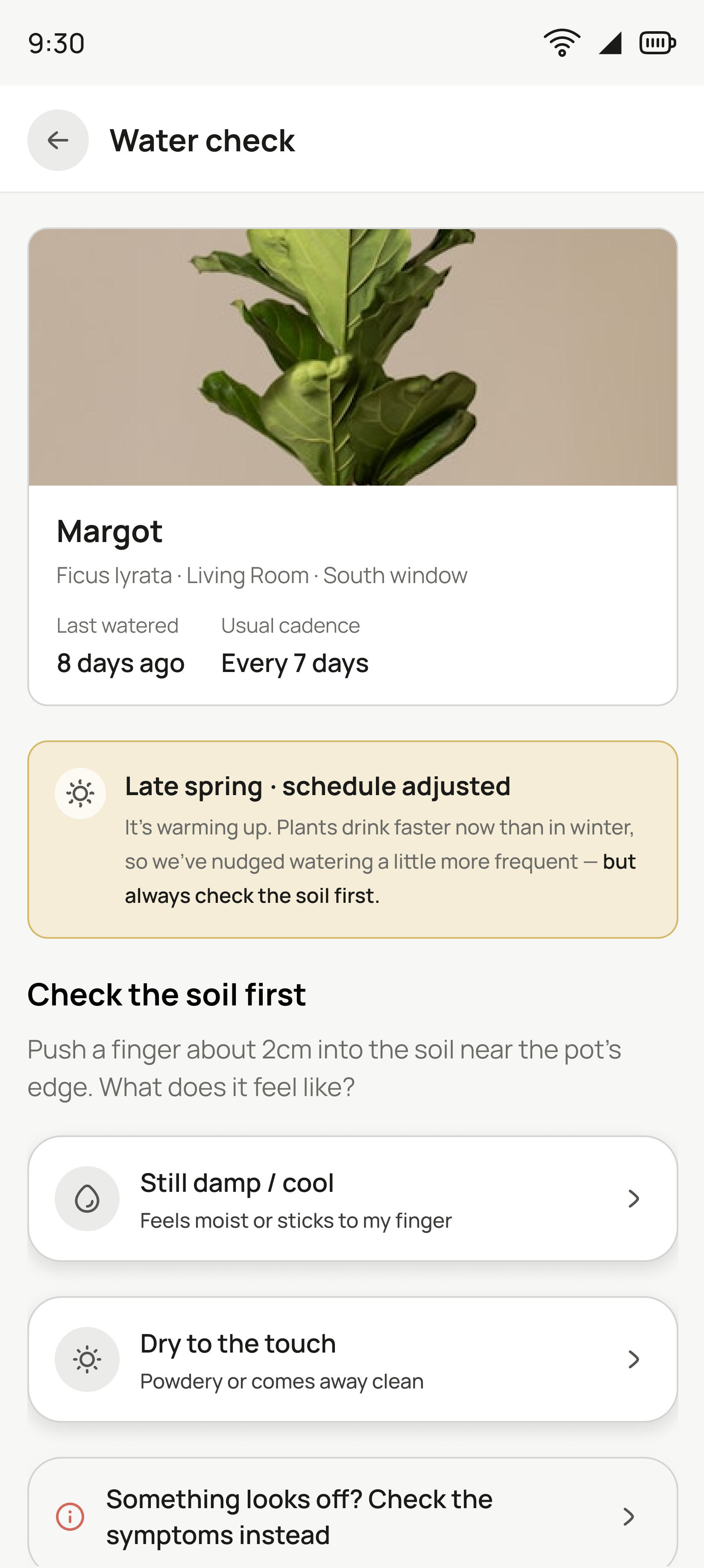
Water check screen: Margot the Ficus lyrata with last watered and usual cadence, a late-spring schedule note, then Check the soil first with damp, dry and symptoms options
Water check
"Should I water?" It answers from what the soil feels like, which is aimed straight at the number one killer: overwatering. Then the app adapts to what you pick.
Grown with you — the plant's growth history
The old version charted centimetres the app has no way to measure. Now it plots one mark per new leaf from the care log, with the winter gap shaded so an empty month reads as a ficus in the cold.
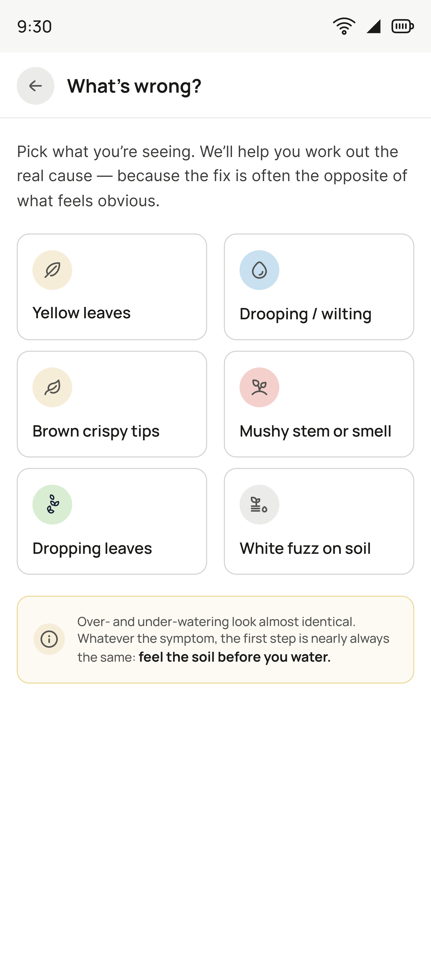
What's wrong? screen in dark theme: pick what you are seeing, with six symptom tiles for yellow leaves, drooping or wilting, brown crispy tips, mushy stem or smell, dropping leaves and white fuzz on soil, then a note that over- and under-watering look almost identical so the first step is to feel the soil before you water
What's wrong?
"Is this too much water or too little?" You pick the symptom you can see, in plain words, before it names a cause.
Community
I kept hearing a simple question from people: “Is anyone else doing this?” Since the hobby could feel lonely, I gave that question its own place in the app. Ranking lives there too, but it is opt-in and off by default.
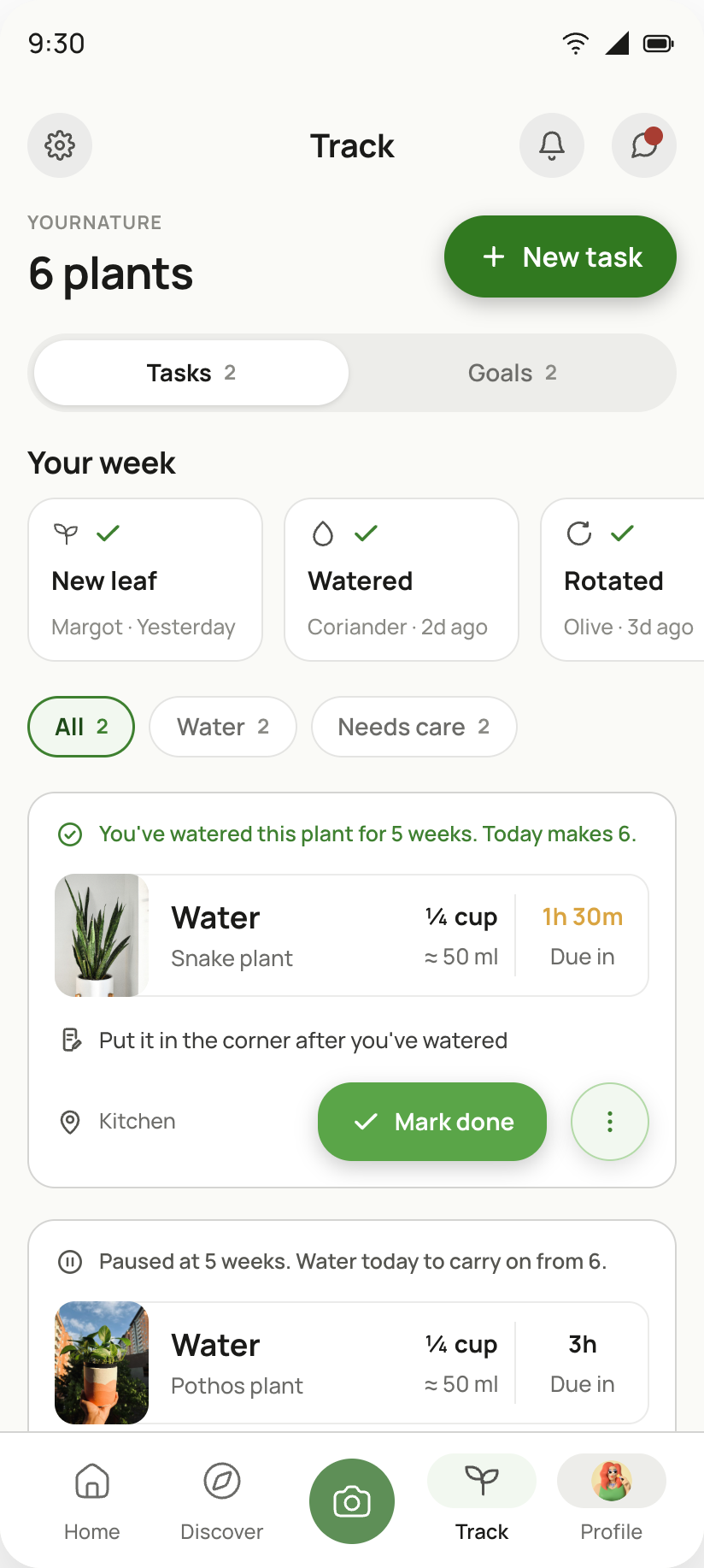
Track tab with six plants: Tasks and Goals tabs, Your week highlights, filter chips and the watering tasks due today
Track
I wanted it to be easy to see what you need to do and which goals you are working towards. Tasks and goals have their own tabs, and the chips help narrow the list down without hiding anything that is due.
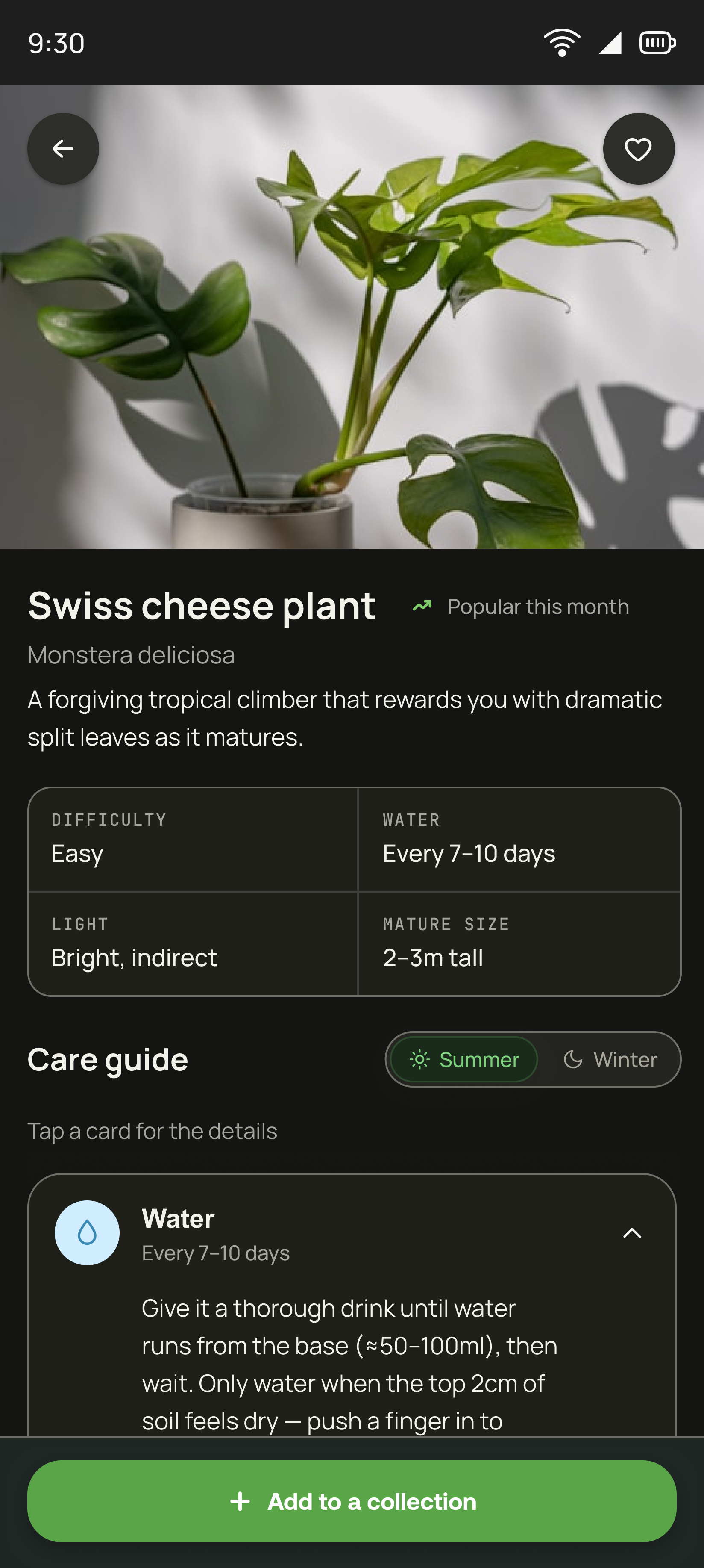
Swiss cheese plant detail screen in dark theme: hero photo, difficulty, water, light and mature size, then a summer or winter care guide and Add to a collection
Plant detail
"How do I look after this one?" Four facts before any prose, and the care guide switches between summer and winter, because the same plant wants different things in February.
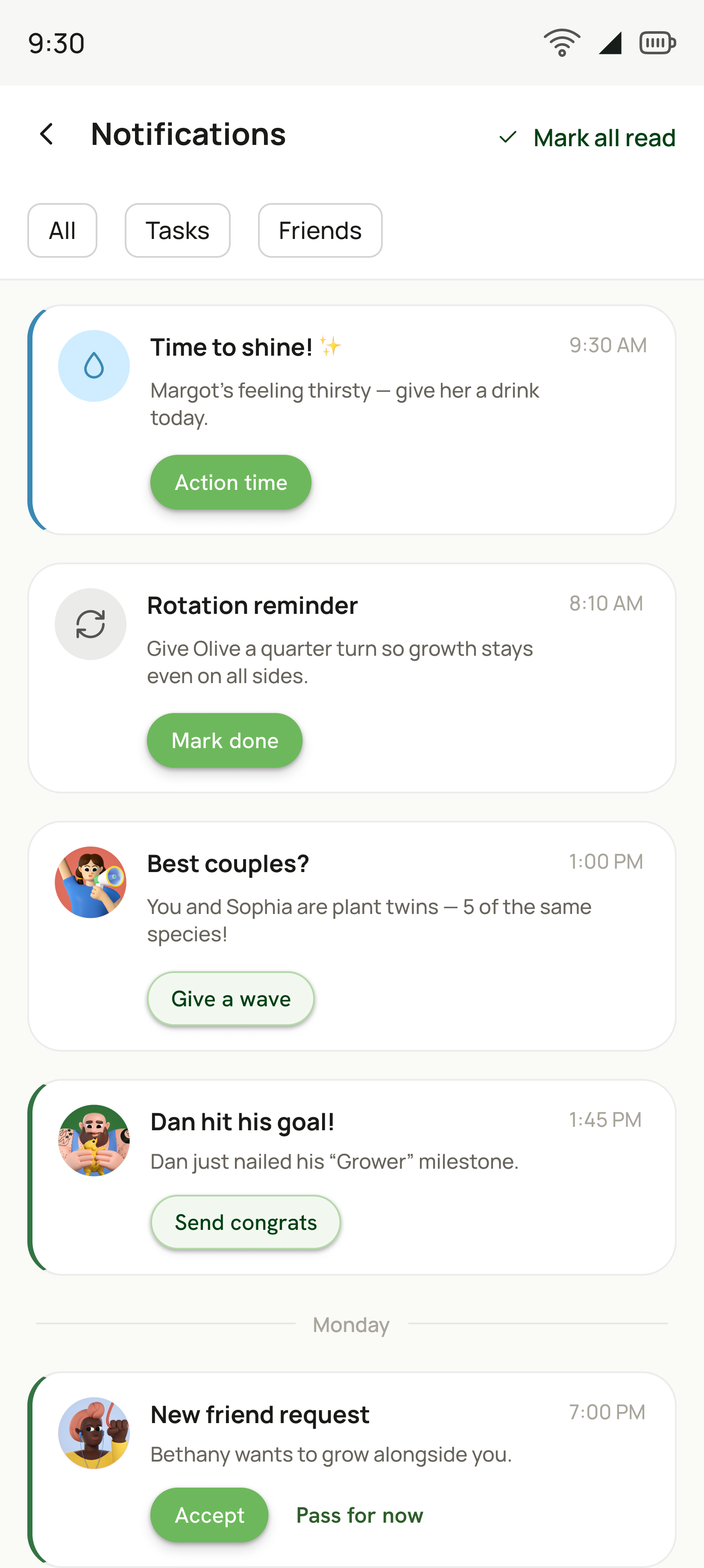
Notifications screen with All, Tasks and Friends filters, and cards for a thirsty plant, a rotation reminder, a plant-twins nudge, a friend milestone and a friend request
Notifications
Every notification carries the action it is asking for, so the list is something you can clear rather than only read. Care and friends are separable with one tap.
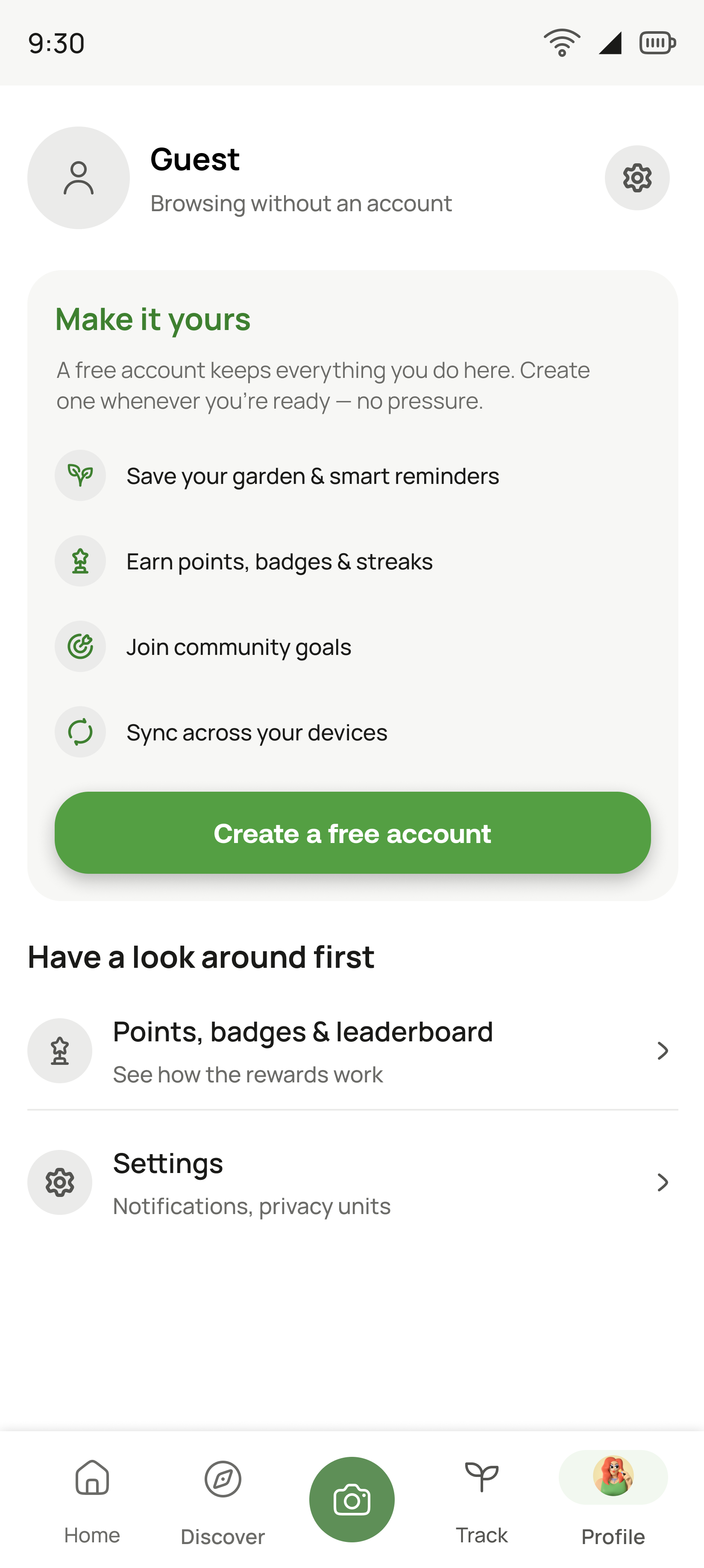
Guest profile: Browsing without an account, a Make it yours card listing four benefits with Create a free account, then a look-around-first list
Profile · guest
The account ask in full, and the only place it is pushy. It lists what an account buys you, and still leaves two doors open to keep looking around.
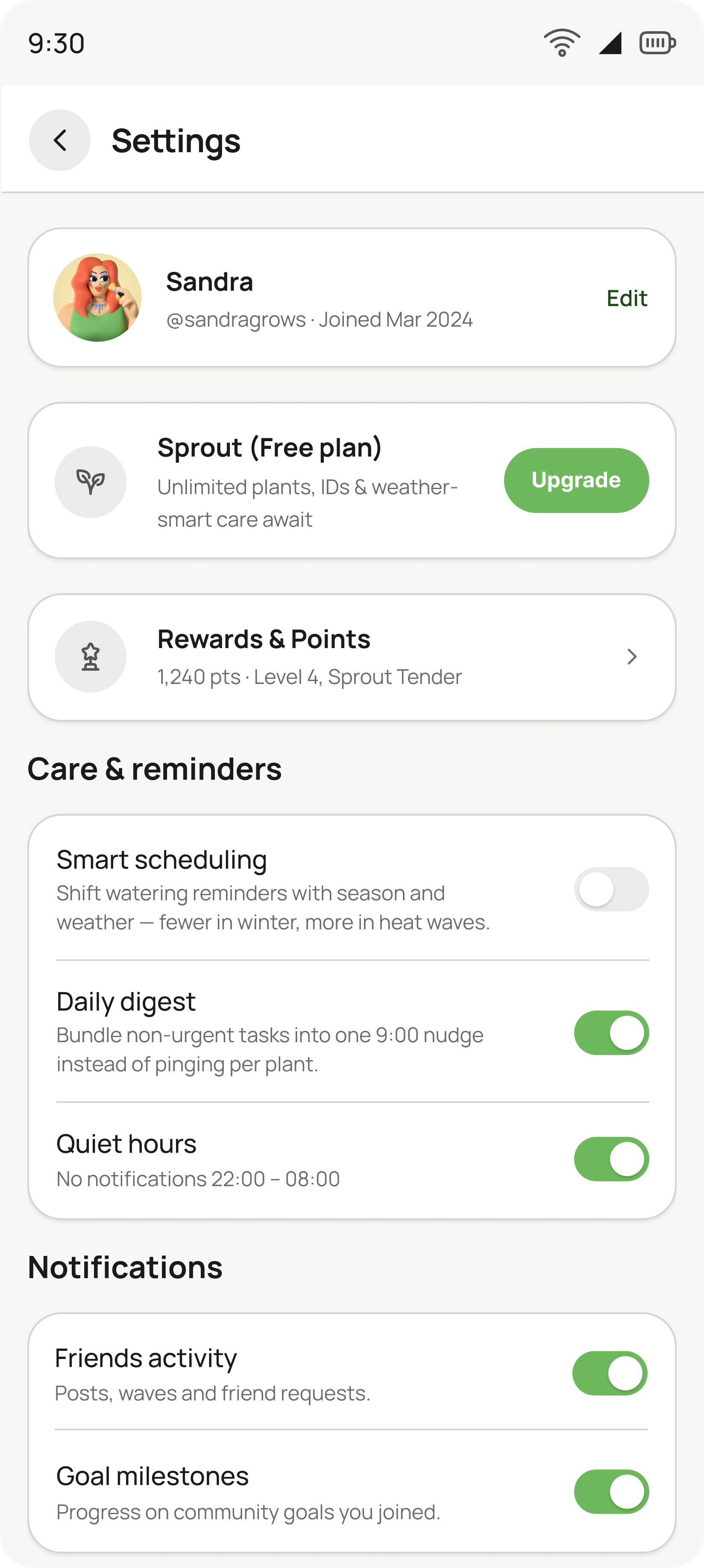
Settings screen with the account row, the Sprout free plan with Upgrade, rewards and points, then care and reminder toggles including smart scheduling, daily digest and quiet hours
Settings
I did not want reminders to feel like a rule the app was forcing on you. They are settings you can control, with smart scheduling, one daily digest instead of constant pings, and quiet hours sitting above the individual notification switches.
Subscription
Free is shown as a plan you’re on, not a nag bar, and it keeps every promise made above. The paid plan is for bigger collections, and the price you see already includes VAT.
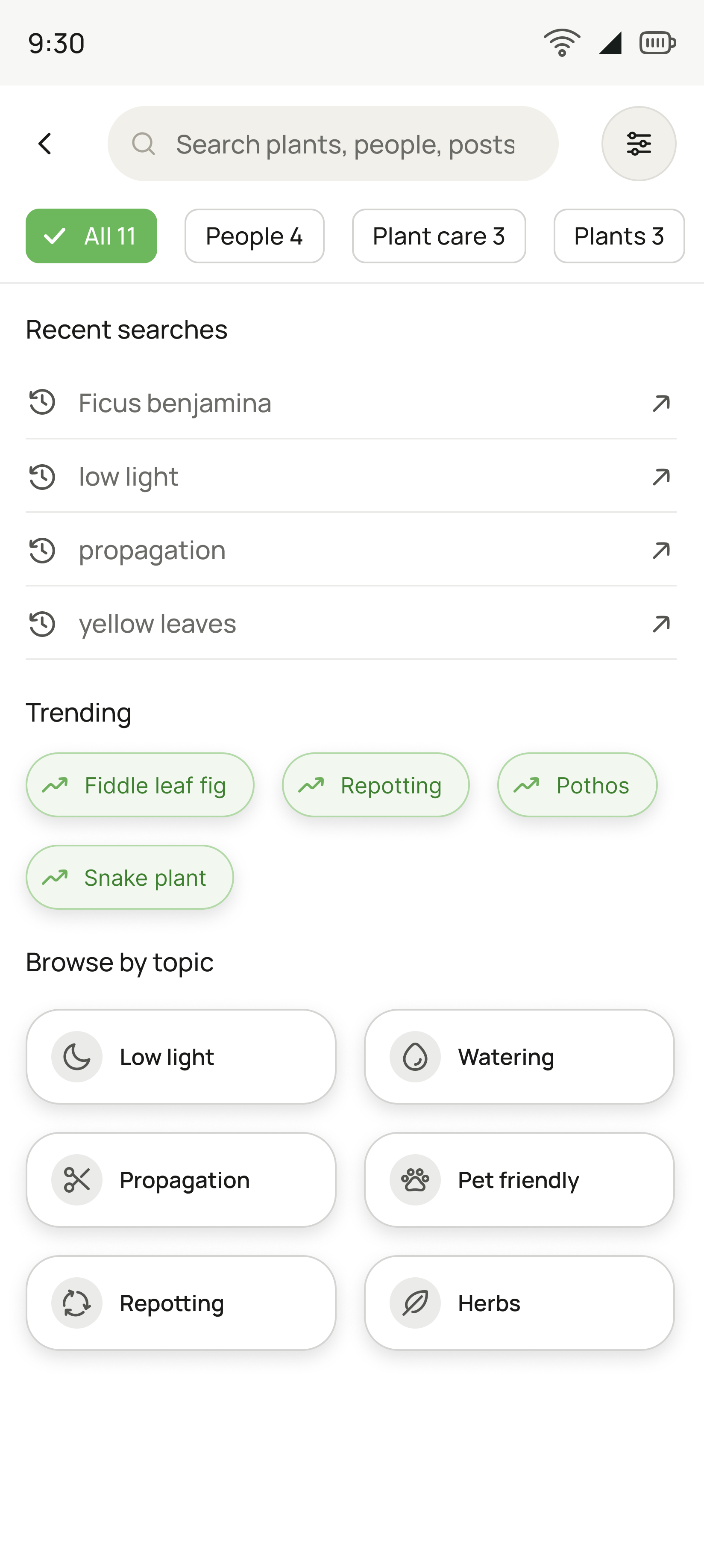
Search screen in dark theme: search field with filters, result-type chips, recent searches, trending tags and browse-by-topic tiles
Search
Before you type, it offers recents, trending and topics. As you type, it suggests matches, which saves typing, catches typos and keeps you off a “No results” page.
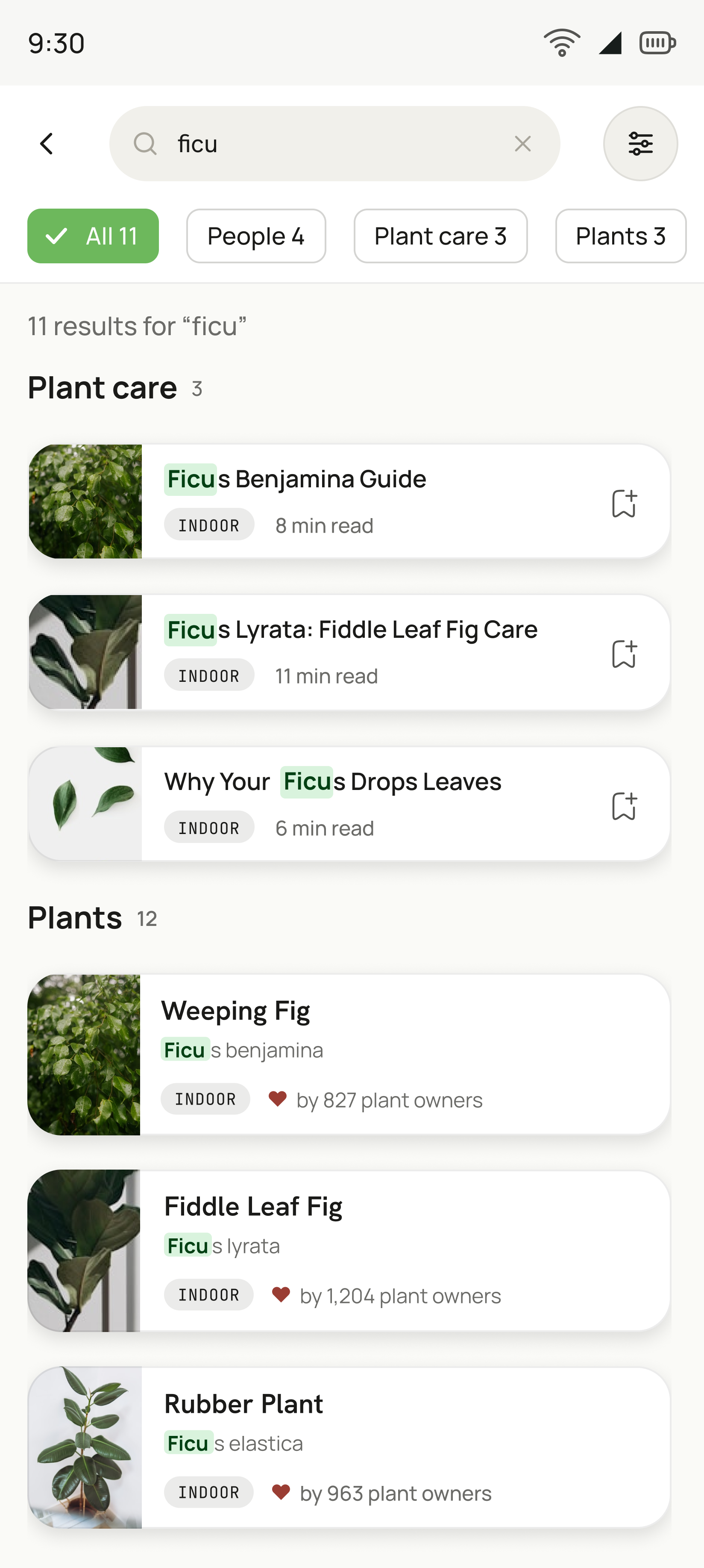
Search results for the partial word ficu in dark theme, grouped into Plant care articles and Plants, with the matched characters highlighted
Search results
Results group by kind and keep the matched characters highlighted, so a half-typed word still reads as the thing you meant.
09 · Reflection

What this project taught me

I didn’t expect YourNature to be this hard, or to take this much of my time. Career coaches say to pick a project that stretches you but stays within your level. At the start, this one was beyond mine.

Only after finishing the designs did I see how much it had taught me. It took far more hours than I planned, and I enjoyed them anyway.

01How to plan and run research
02How to run a fair A/B comparison
03How to run comprehension and usability tests
04What to ask users, and what not to
05Designing from empathy, not assumptions
06Thinking across every channel a user touches
07Weighing business goals against user needs

Let’s work together

I’m looking for a product design role where I can do both the research and the craft. If that sounds like your team, I’d love to talk.

Say hello
[email protected]Email Dumitru CiugunovLinkedIn
YourNature · my own concept project · 2026 · Designed by Dumitru Ciugunov
Figma · Prototyping · User research
Next case study

YourShelf E-Commerce Check Out Design

A checkout designed from scratch for an independent bookshop, working from published abandonment research. One order model, costs shown before they are charged, and four failure states you can click.

  • Desktop web
  • E-commerce
  • Checkout flow
  • Interaction design
  • Error states
Read the case study
The YourShelf order confirmation screen on a laptop, on a sunlit desk beside a plant and a mug of coffee.
All work