Back to portfolio
Interaction design · Checkout · YourShelf Booksellers

Designing checkout for a bookshop losing buyers halfway through

One order model, costs shown before they're charged, and failures that keep what you typed.

{{ p.n }}
{{ h.n }}
{{ h.t }}
{{ h.b }}
{{ p.n }} {{ p.l }}
{{ m.k }}
{{ m.v }}
Jump to Watch it run The problem The decisions When it breaks How I worked What I learned
01 · The problem

Seven in ten carts are abandoned. Almost none of it is about how the page looks.

I had six people lined up to interview, and I chose not to. On an earlier project I ran ten interviews, and they were great for understanding how people think. They weren't enough to show how often a problem happens. Checkout abandonment is a question about thousands of shoppers, and six conversations can't answer it. So I used large published studies of real shoppers instead. Their findings came down to four fears, and those became my brief.

Why people leave checkout % of shoppers who left
{{ f.q }}
{{ f.cause }}
{{ f.pct }}
Baymard Institute, reasons for cart abandonment ↗, US online shoppers (latest survey, page updated Sept 2025). Multi-select, "just browsing" excluded. Another 12% couldn't see the total up front.
The data says
40% leave over extra costs
→
✕ The obvious read
Costs are too high
Pricing isn't a design lever, and it doesn't explain the leaving.
→
My read
It's when a cost shows up, not how big it is
A fee on screen one is information. After you've typed your address, it feels like a trick.
→
So
It's a data problem, not a screen problem
If every screen does its own maths, one of them will break the news late.
How I got from research to screens

I asked three questions about each fear. The answers pointed to the fix.

Fear How?does it happen Why?do they leave Where?CartDetailsDeliveryPaymentDone So I made
{{ r.pct }} {{ r.q }}
{{ r.how }} {{ r.why }}
{{ r.made }} {{ r.link }}
What I made, in order
{{ a.n }} {{ a.t }} {{ a.b }}
What I got wrong I kept testing the route I already knew worked. When I used it like someone actually trying to buy a book, the gaps showed up in five minutes.
02 · The decisions

It started with a mistake: my first draft charged the wrong total

It was a prototyping problem. In Figma I linked screen to screen, but I never connected the book format and quantity options to the price container. Each screen showed its own numbers, so they drifted apart. Fixing it showed me how much depends on components being connected: a properly built prototype catches this kind of error and saves work later.

Decision 01 Answers fear 1 · the price is not the price

One money model, and every screen only reads from it
Paperback$19.99
Sales tax$2.99
Total charged$19.99
Before Format and quantity weren't linked to the price, so each screen kept its own total. Tax shown, not charged. Reconstructed.
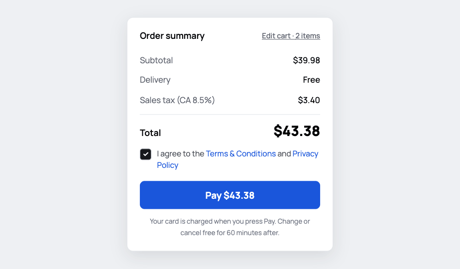
Order summary: Sales tax (CA 8.5%) $3.40, total $43.38, button Pay $43.38
After The rate is named, and the button repeats the total.
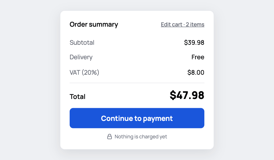
Same order to a UK address: VAT (20%) $8.00, total $47.98, still in USD
After · UK Tax follows the address. Currency stays USD.
The question
{{ c.q }}
✕ I ruled out
{{ o.t }}
{{ o.r }}
One order model · $43.38
{{ sv.n }} {{ sv.v }}
{{ pb.x }}
✓ What I chose
{{ o.t }}
{{ o.r }}
One order model · $43.38
{{ sv.n }} {{ sv.v }}
{{ pb.x }}
Evidence
40% leave over extra costs, the top cause. Another 12% leave because they can't see the total up front.
Trade-off
Weeks spent redrawing five screens I thought were finished.
Decision 02 Answers fears 3 and 4 · forced accounts, too much asked

Ask for seven things, and let some people answer nothing
Before
{{ lf.v1 }}|
{{ lf.v2 }}|
Which field was which?
After Full name
{{ lf.a1 }}|
City
{{ lf.a2 }}|
Still labelled.
Field names sit above the box, so they don't vanish when you type.
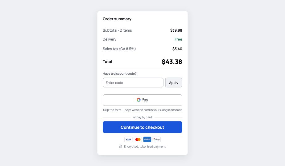
Cart summary with Google Pay above the Continue to checkout button 2
Google Pay first. 2 If you have it, you never see the form.
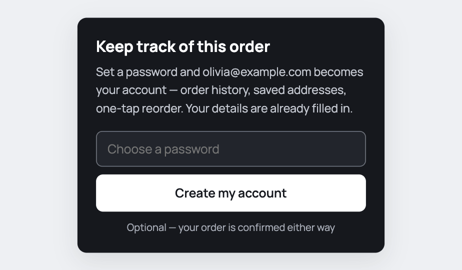
Confirmation screen offering an account after payment, email already filled in
Account after paying. Your details are already filled in, and it's optional.
The question
{{ c.q }}
✕ I ruled out
{{ o.t }}
{{ o.r }}
✓ What I chose
{{ o.t }}
{{ o.r }}
Evidence
18% leave over a forced account. 17% because checkout is too long.
Trade-off
No company name, and phone is optional. Either comes back if the data shows it costs sales.
The words

Each line answers something the shopper is already asking

{{ c.before }} {{ c.after }}
The flow

What's in the basket decides which steps you see

Cart
→
Delivery
→
Payment
→
Review
→
Confirmed
Google Pay jumps straight to Review.
E-books: just an email.
Collect: pick a shop.
Card declined? Back to Payment, fields kept.
03 · When it breaks
Decision 03 Answers fear 2 · one error and I lose everything

Build the failure states, don't just describe them

When something fails, nothing you typed is lost, and you're told exactly what happened.
{{ s.k }}
{{ s.fear }}
{{ s.resp }}
The question
{{ c.q }}
✕ I ruled out
{{ o.t }}
{{ o.r }}
One order model · $43.38
{{ sv.n }} {{ sv.v }}
{{ pb.x }}
Payment
Card number
Secure checkout HelpReturnsPrivacy
Before Padlock in the footer, a scroll away from the card field.
✓ What I chose
{{ o.t }}
{{ o.r }}
One order model · $43.38
{{ sv.n }} {{ sv.v }}
{{ pb.x }}
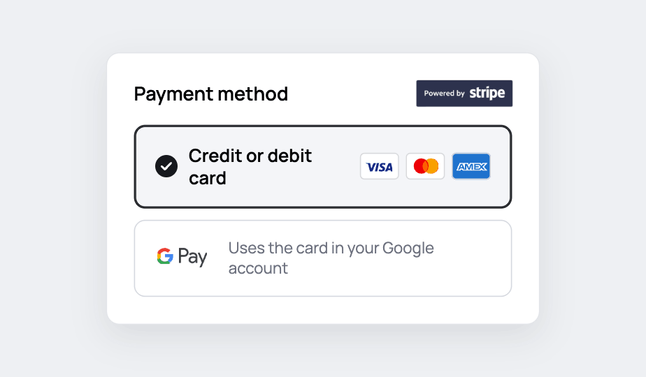
After: the Powered by Stripe badge sits in the Payment method header, directly above the card option
After Stripe badge in the Payment method header, right above the card.
Evidence
19% don't trust the site with their card. Another 17% have left over errors or crashes.
Trade-off
Much slower than drawing them. It's also how I found the two gaps below.
04 · How I worked, and what's next

Now I write the data model before I draw the second screen

How I used AI
{{ a.k }} {{ a.v }}
What I'd measure
{{ h.m }}
{{ h.t }}
Gaps I found late
Determined
A Science of Life Without Free Will
Robert M. Sapolsky
{{ sc.price }}
✓ {{ ch.label }} {{ ch.note }}
− 1 + ↓ Instant download by email Save for later Remove
Order summary {{ sc.subLbl }}{{ sc.sub }} Delivery{{ sc.del }} Sales tax (CA 8.5%){{ sc.tax }} Total{{ sc.tot }} Continue to checkout
{{ sc.note }}
{{ sc.status }}
{{ sc.title }}
{{ sc.why }}
With a real shop, in this order Data finds where. People explain why.
{{ p.n }} {{ p.kind }}
{{ p.t }}
05 · What this brief taught me

Never take a flow for granted. There's always a gap.

01
Build the failure flows, then test them

A happy path that works proves very little. The gaps only showed up once I built what happens when things go wrong, and clicked through it the way a shopper would.

In this project Building the declined card showed that every field had to survive it. Otherwise recovery meant typing the whole order again.
02
Prototyping shows how the parts connect

Once the screens were wired to real data, I could see how each component depended on the others. When you know what you're doing, a prototype gets you there faster than static screens.

In this project Three screens showed three different totals. I only saw it once a promo code had to change all three at once.
03
Show information where it's needed, and again later

Telling the shopper something once isn't enough. They may need the same fact again further down the flow, so it has to appear on the pages where it matters.

In this project The e-book says "Instant download by email" in the cart, and "Emailed after payment" at review. The total sits in the summary, and again on the Pay button.
Who made this
I like the flows other people find boring

Checkouts, forms, settings. Anywhere money is involved and one wrong word makes someone stop trusting you.

A Uxcel challenge brief. The shop is invented, the research is real, and I'm not claiming a result.

Next case study

YourNature: a plant care app built on meaning and connection

A plant care app built from scratch around the reasons owners abandon them. Ten interviews, two usability sessions and a comparative card test, with seven working prototypes on the page.

  • Mobile app
  • UX research
  • Usability testing
  • Interaction design
  • Prototyping
Read the case study
The YourNature cover: the app's Track screen on a phone, on a kitchen counter among plants.
All work